Featured Speakers
Keynote Speaker: Colin Ware, Data Visualization Research Lab
Talk: "Thinking with Visualizations"
Visualizations help us to solve problems by finding patterns in graphical displays of data. For example, finding a pattern of highly connected components in a node link diagram can help us understand the architecture of a software system. Finding a long, red, fairly straight line on a map can show us the best way of driving between two cities. This talk will describe how thinking with visualizations involves the construction of visual queries on the display. Once a visual query is constructed, a visual search strategy through eye movements and attention to relevant patterns provides answers. Recent results from cognitive psychology can help us understand the visual thinking process. I will show how understanding the nature of visual queries, and the capacity of visual working memory, can be used to predict which visual tasks will be easy and which will be difficult, if not impossible. Examples from common visualizations and interactive techniques will be used to illustrate the central concepts.
Bio:
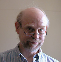 Colin Ware's research is focused on applying our understanding of human perception to information display. He has published more than 100 articles on this subject and a recent book: Information Visualization: Perception for Design. In addition to theory-based research Ware likes to build useful visualization systems. Fledermaus, a GIS visualization package originally by him and his students is now the leading 3D visualization system used in oceanography. Ware is a professor of Computer Science and Director of the Data Visualization Research Laboratory at the University of New Hampshire. He has degrees in both experimental psychology (PhD, Toronto) and Computer Science (M.Math, Waterloo).
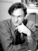
Capstone Speaker: Ben Shedd, Princeton University and Shedd Productions, Inc.
Talk: "Exploding The Frame: Designing for Wall-Size Computer Displays"
 High-resolution wall-size digital displays present significant new and
different visual space to show and see imagery. I have been working with
two wall-size digital displays at Princeton University for five years
and directing and producing IMAX films for a decade, and I have noted
some unique design considerations for creating effective visual images
when they are spread across entire walls. I suggest these "frameless"
screens - where images are so large we need to look around to see the
entire field - need different ways of thinking about image design and
visualization. Presenting such things as scale and detail take on new
meaning when they can be displayed life-size and not shown in the
context of one or many small frames such as we see everywhere.
High-resolution wall-size digital displays present significant new and
different visual space to show and see imagery. I have been working with
two wall-size digital displays at Princeton University for five years
and directing and producing IMAX films for a decade, and I have noted
some unique design considerations for creating effective visual images
when they are spread across entire walls. I suggest these "frameless"
screens - where images are so large we need to look around to see the
entire field - need different ways of thinking about image design and
visualization. Presenting such things as scale and detail take on new
meaning when they can be displayed life-size and not shown in the
context of one or many small frames such as we see everywhere.
These design ideas will be of use for pervasive computing, interface
research and design, interactive design, control design, representations
of massive data sets, and creating effective displays of data for
research and education.
Keywords:
Display walls, giant screens, wall-size displays, tiled displays, visual
interface, graphic design, high-resolution, visualization, interface
design.
Bio:
 Ben Shedd is an Academy Award winning film and video
director/producer/writer of 29 films and videos, including four IMAX
films. Fourteen of his films have been about science and technology.
Shedd was a member of the original PBS Series NOVA production team at
WGBH-TV Boston and worked on the very first NOVA program 30 years ago.
Ben Shedd is an Academy Award winning film and video
director/producer/writer of 29 films and videos, including four IMAX
films. Fourteen of his films have been about science and technology.
Shedd was a member of the original PBS Series NOVA production team at
WGBH-TV Boston and worked on the very first NOVA program 30 years ago.
Ben Shedd mixes his production work with university teaching and has
held Adjunct faculty positions at four universities and colleges. For
the past five years, Shedd has been part-time Senior Research Scholar
and Lecturer in the Department of Computer Science at Princeton
University where he has been researching and teaching about future media
technologies with the wall-size computer screens. This is the 25th
anniversary year of the premiere of Ben's Academy Award winning
documentary short THE FLIGHT OF THE GOSSAMER CONDOR, about the invention
of history's first successful human-powered airplane.
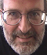
Evening Invited Speaker: W. Bradford Paley, Digital Image Design & Columbia University
Talk: "Information Esthetics: from MoMA to Wall Street"
My after-dinner talk has the goal of being a visual dessert, showing some of the information designs and explorations that I've put together in the last twenty years as a practicing designer and more recently, as an artist. I'll show the ones that people reacted to most strongly; partly to soothe and entertain, but partly in the hopes that some of the techniques I apply might be useful in the work of other attendees.
To that end I'll present a simplified Knowledge Acquisition Pipeline, a kind of designer's checklist that has been valuable in guiding my students and me while creating information-rich displays and user interfaces. It helps organize the wide variety of techniques available to us as information designers. But more--it helps us understand why they might work, where they might be useful in a design, and even what types of information can best be shown with which techniques. It works as a generative guideline as well as an intellectual framework. I'll tie parts of the examples back to this pipeline to show how it works in practice.
The application of this pipeline to visualization work suggests that as a field we are getting good value out of our understanding of the earlier processes--those having to do with sensation and perception. But later processes still have a lot of room for exploration: the visual attributes we use to represent data can often be made more specific, and therefore both more communicative and easier to decode. The world is richer than we can describe with circular nodes and linear links. And when we can get a visual vocabulary from the target audience, their own higher level semantic relationships may also be more easily absorbed and manipulated. I suggest that what such "illustrative information displays" lose in generality they more than make up in ease of nterpretation and viewer engagement.
Bio:
 W. Bradford Paley is an interaction designer and artist whose focus in
both worlds is readable, clear, and engaging expression of complex data.
His visual representations are inspired by the calm, richly layered
information in natural scenes. His process invokes three perspectives:
rendering methods used by fine artists and graphic artists are informed
by their possible underpinnings in human perception, then applied to
creating narrowly-scoped, almost idiosyncratic representations whose
visual semantics are driven by the real-world metaphors of the experts
who know the domains best.
W. Bradford Paley is an interaction designer and artist whose focus in
both worlds is readable, clear, and engaging expression of complex data.
His visual representations are inspired by the calm, richly layered
information in natural scenes. His process invokes three perspectives:
rendering methods used by fine artists and graphic artists are informed
by their possible underpinnings in human perception, then applied to
creating narrowly-scoped, almost idiosyncratic representations whose
visual semantics are driven by the real-world metaphors of the experts
who know the domains best.
Brad did his first computer graphics in 1973, founded Digital Image
Design Incorporated (didi.com) in 1982, and started doing financial
& statistical data visualization in 1986. He has exhibited at the
Museum of Modern Art; he created TextArc.org; he is in the permanent
collection of the Whitney Museum of American Art; has received multiple
grants and awards for both art and design, and his designs are at work every
day in the hands of brokers on the floor of the New York Stock Exchange.
He is an adjunct associate professor at Columbia University, and is
director of Information Esthetics: a fledgling interdisciplinary group
exploring the creation and interpretation of data representations that
are both readable and esthetically satisfying.